Costco App Analysis
A usability and accessibility evaluation of the Costco app and website.
Scroll ↓
Overview
This project evaluated the usability and accessibility of the Costco mobile app, focusing on the user experience from login through transaction completion.
Working as part of a five-person research team in my first graduate UX project, we conducted heuristic evaluations, competitive analysis, and moderated usability testing to identify key friction points and opportunities to improve clarity, consistency, and efficiency across the app.
UX Researcher, UX Designer, and Accessible designer
Role
Timeline
August 2024 - December 2024
Tools
Figma, WCAG

Context
Costco’s mobile app supports millions of users navigating membership, shopping, and in-warehouse experiences. While the app offers robust functionality, these overlapping experiences can introduce usability and accessibility challenges that impact how easily users complete everyday tasks.
As frequent shoppers increasingly rely on mobile experiences, even small points of friction can create confusion, inefficiency, or frustration.
Problem Statement
How might we identify and address usability issues in the Costco mobile app to create a more consistent, intuitive shopping experience for users?
Task & Approach
Our goal was to evaluate the Costco app from both expert and user perspectives to uncover usability breakdowns and inform actionable recommendations.
We used a mixed-methods research approach that included:
Heuristic evaluation
Competitive analysis
Moderated usability testing with real users
Insights from each phase informed the next, allowing us to validate findings and focus on the most impactful issues.
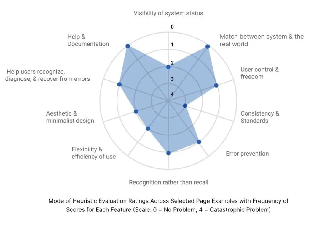
Early Insights
We began with a heuristic evaluation to surface early usability concerns and guide deeper user research. Key issues emerged around:
Flexibility and efficiency of use
Consistency across navigation and features
The app performed well in areas such as recognition rather than recall and alignment with real-world expectations, but these inconsistencies signaled opportunities for improvement that we explored further through user testing.
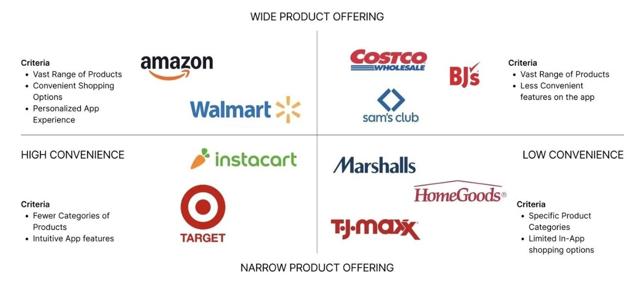
Understanding the Landscape
To establish usability benchmarks and understand industry standards, we analyzed both direct and indirect competitors. Using our heuristic findings as a guide, we evaluated how other platforms handled:
Search and filtering experiences
Homepage personalization and discoverability
Navigation consistency
Visual clarity and hierarchy
This helped us distinguish which challenges were unique to Costco and which reflected broader usability patterns.
User Research
We conducted moderated usability sessions with six participants using a think-aloud protocol and screen sharing to observe real-world behaviors, decision-making, and points of confusion within the Costco app.
Ages 25–35
Varied occupations and genders
Participants
Timeline
Pre-test questions to build context
Task-based testing across key user flows
Post-test reflection and feedback
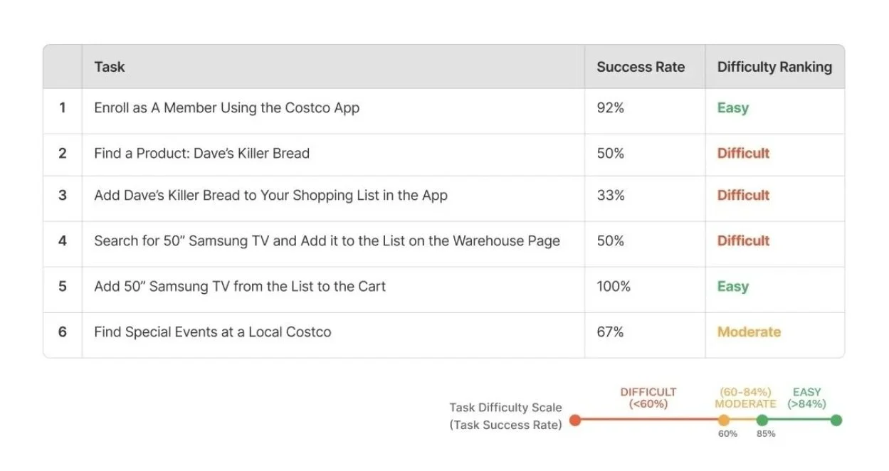
Tasks & Performance
While participants were generally able to complete core tasks, several user flows introduced friction and confusion. Key tasks included:
Membership enrollment
Searching for and adding items
Finding local warehouse events
Tasks ranged from easy to difficult, revealing patterns around navigation inconsistency and unclear feature grouping that informed our recommendations.
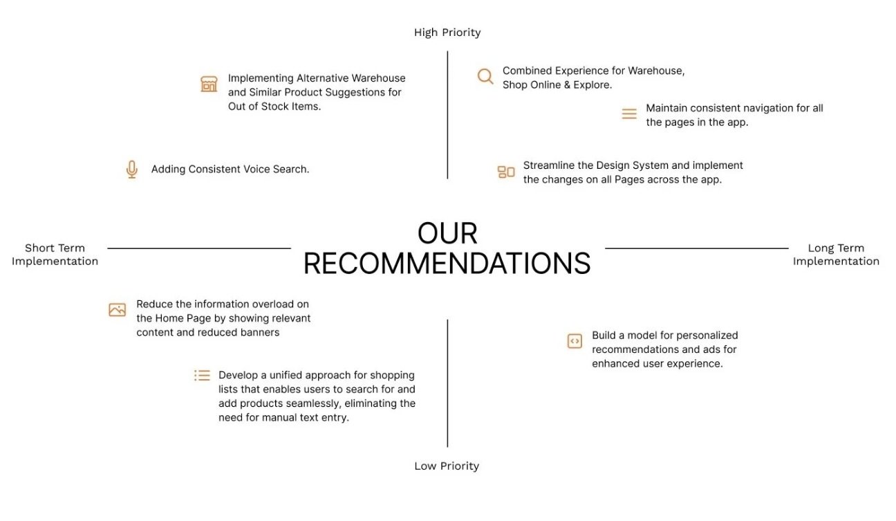
Recommendations
Based on our findings, we prioritized recommendations by impact and feasibility to support both short- and long-term improvements.
Key recommendations included:
Unifying the experience across Warehouse, Shop Online, and Explore
Maintaining consistent navigation patterns throughout the app
Streamlining and applying the design system across all pages
These changes aim to reduce cognitive load and create a more cohesive, intuitive experience for users.
My Learnings
As my first graduate UX project, this experience reinforced the value of collaboration, communication, and research-driven decision-making.
1. Research confidence: Conducting usability sessions strengthened my ability to uncover meaningful user insights.
2. Bias awareness: Tight timelines highlighted the importance of intentional participant recruitment.
3. Leadership & teamwork: Clear roles, consistent meetings, and shared goals enabled our team to work efficiently and collaboratively.