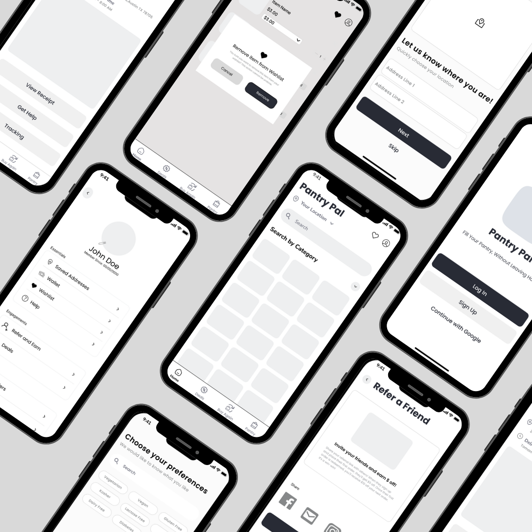
Pantry Pal
Pantry Pal is a mobile app that streamlines and personalizes the grocery shopping experience.
Scroll ↓
Overview
Pantry Pal is an end-to-end mobile app concept designed to simplify grocery shopping through personalization, smarter filtering, and intuitive navigation.
This project explored how busy shoppers navigate grocery delivery apps today and how clearer information, fewer steps, and personalized features could create a more efficient, frustration-free experience.
UX Researcher, UX Designer, and Product Manager
Role
Timeline
August 2024 - December 2024
Tools

Figma, Canva
Context
Online grocery shopping is meant to save time, but for many users, it creates new friction. Apps like Instacart often overwhelm users with unnecessary steps, limited personalization, and confusing navigation.
For young professionals juggling packed schedules, grocery shopping becomes one more stressful task rather than a convenience. Pantry Pal was born from the question:
“How might we make grocery shopping feel faster, clearer, and more tailored to individual needs?”
Problem Statement
How might we design a grocery delivery experience that reduces friction, improves personalization, and helps users shop efficiently without feeling overwhelmed?
Market Research
We analyzed direct and indirect competitors to identify opportunities Pantry Pal could address.
Direct competitors
Uber Eats: Easy driver communication, but limited product details
Walmart: Multi-service integration, but no control over replacement items
Indirect competitors
HelloFresh: Clean interface, but subscription-based
DoorDash: Convenient delivery, but higher grocery prices
Competitors
We focused on two core principles:
Visibility of system status: Users should always know what’s happening (cart updates, checkout progress).
Match with real-world expectations: Familiar language, intuitive filtering, and a checkout flow that mirrors in-store shopping behavior.
Heuristic Evaluation
Define
Based on research, we defined our primary persona as a busy young professional who values speed, clarity, and cost savings.
Poor filtering options
Lack of personalized suggestions
Difficulty managing cart and substitutions
Pain Points
Goals
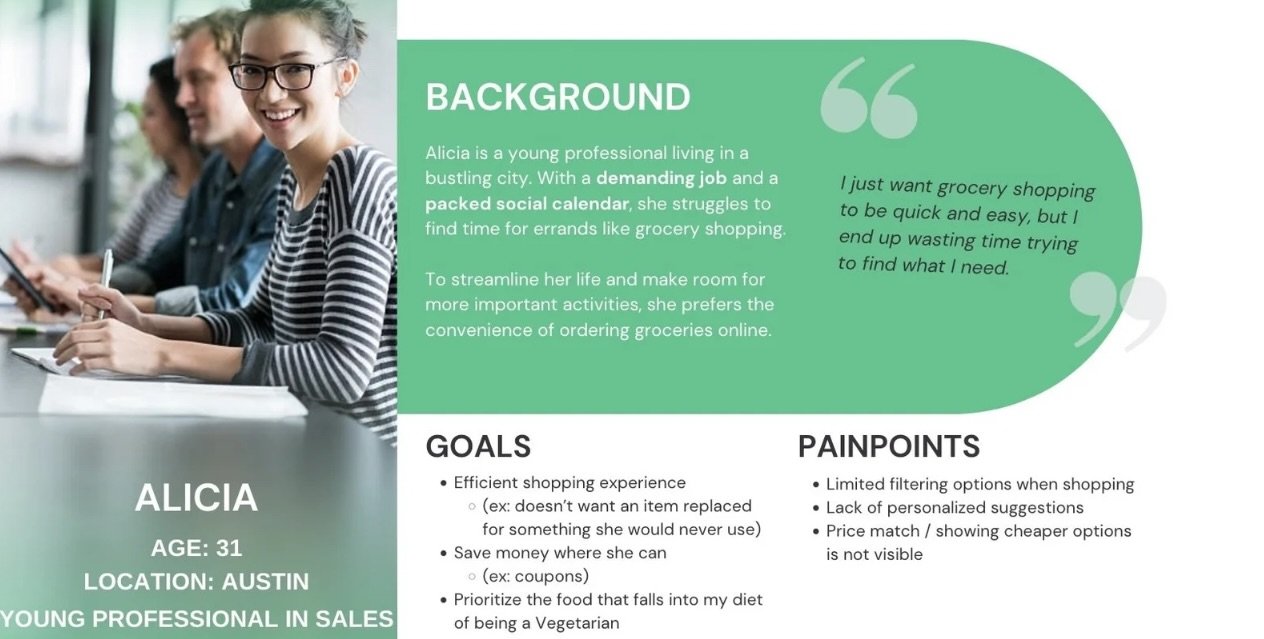
Shop efficiently
Avoid unwanted replacements
Save money through deals and coupons
Ideate
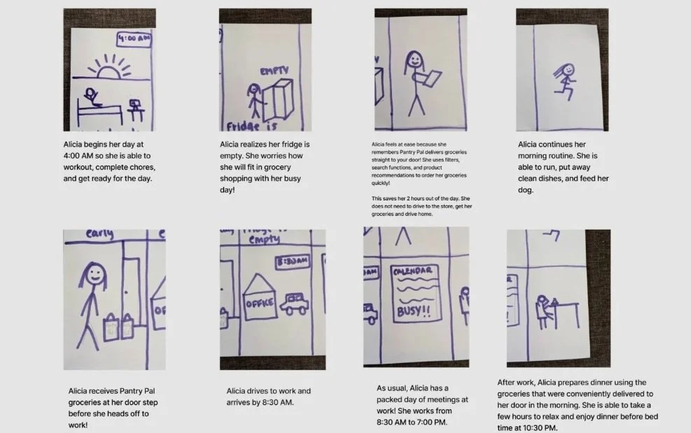
We created storyboards to visualize a user with a packed schedule trying and failing to fit grocery shopping into their day. The solution focused on planning ahead, personalization, and fewer decisions at checkout.
Storyboards
Paper sketches and low-fidelity wireframes helped us quickly explore:
Clear task sequences
Reduced cognitive load
Simple navigation for both new and returning users
Low-Fi Concepts
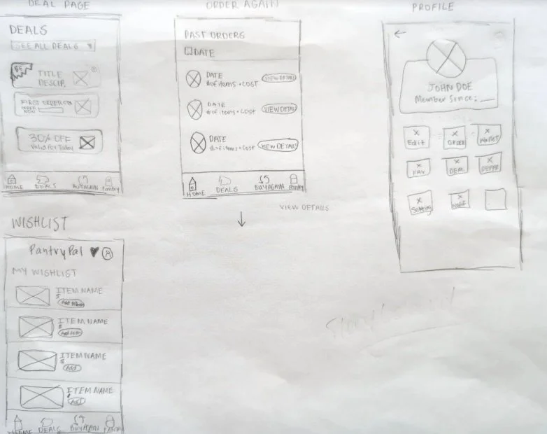
We narrowed the scope to essential grocery flows:
Account setup with optional food preferences
Item discovery through Deals and Wishlist pages
Streamlined checkout and delivery tracking
This focus allowed us to design a clear, efficient end-to-end journey without overcomplicating the experience.
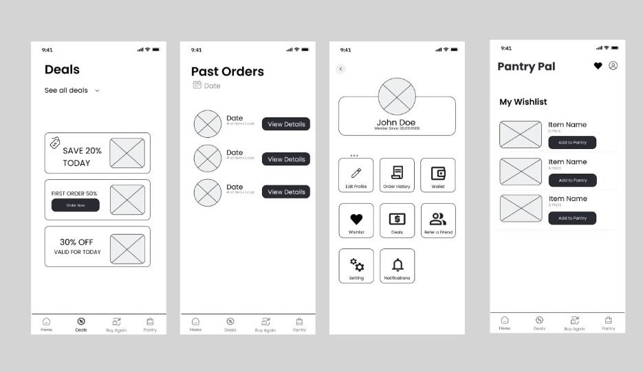
Prototype
We conducted six pilot usability tests on our mid-fidelity prototype. Key insights:
Button labels and navigation needed clarification
Inconsistencies between screens disrupted flow
Users found the term “Pantry” confusing, but it aligned with our brand identity, so we refined rather than removed it
Each round of feedback informed iterative improvements to layout, language, and interaction patterns.
Test
Final Solution
Based on our findings, we prioritized recommendations by impact and feasibility to support both short- and long-term improvements.
Key recommendations included:
Unifying the experience across Warehouse, Shop Online, and Explore
Maintaining consistent navigation patterns throughout the app
Streamlining and applying the design system across all pages
These changes aim to reduce cognitive load and create a more cohesive, intuitive experience for users.
My Learnings
1. Early user feedback matters: Pilot testing revealed issues we wouldn’t have caught internally.
2. Communication is critical: Tight timelines required strong collaboration and clear delegation.
3. Leadership through action: Taking initiative improved team efficiency and overall product quality.